Your Load Generator is Probably Lying to You - Take the Red Pill and Find Out Why


Pretty much all your load generation and monitoring tools do not work correctly. Those charts you thought were full of relevant information about how your system is performing are really just telling you a lie. Your sensory inputs are being jammed.
To find out how listen to the Morpheous of performance monitoring Gil Tene, CTO and co-founder at Azul Systems, makers of truly high performance JVMs, in a mesmerizing talk on How NOT to Measure Latency.
This talk is about removing the wool from your eyes. It's the red pill option for what you thought you were testing with load generators.
Some highlights:
If you want to hide the truth from someone show them a chart of all normal traffic with one just one bad spike surging into 95 percentile territory.
The number one indicator you should never get rid of is the maximum value. That’s not noise, it’s the signal, the rest is noise.
99% of users experience ~99.995%’ile response times, so why are you even looking at 95%'ile numbers?
Monitoring tools routinely drop important samples in the result set, leading you to draw really bad conclusions about the quality of the performance of your system.
It doesn't take long into the talk to realize Gil really knows his stuff. It's a deep talk with deep thoughts based on deep experience, filled with surprising insights. So if you take the red pill, you'll learn a lot, but you may not always like what you've learned.
Here's my inadequate gloss on Gil's amazing talk:
How to Lie With Percentiles
-
Latency is the time it takes for one operation to happen. If there are a million operations then there are a million latencies.
-
The goal: describe how those million latencies behave.
-
We need to communicate, think, evaluate, set requirements for how latencies behave.
-
So we need to be able describe the distribution of a set of latencies, not just one latency.
-
-
Saying the most common case was X is one of the least relevant things you can say about behavior.
-
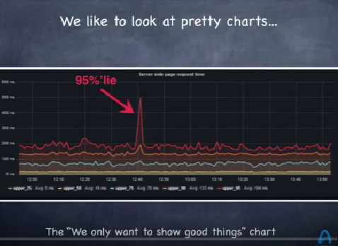
This graph is a typical example from a dashboard of a monitoring system where you are watching the response time of a system over time. This is a two hour window. The lines are the 95%'ile, 90%'ile, 75%'ile, 50%'ile, an 25%'ile. Obviously what peaks your interest is the big red spike in the 95%'ile response of the server side page request time. The 90%'ile shot up at about the same time. The rest of them didn't shoot up that much, so we should probably pay attention to it.
-
Such a chart looks good, but it's completely meaningless. It's the chart to show someone when you want to hide the truth from them. It’s a chart of the good stuff, which is why it’s a good chart for a marketing system.
-
What’s not on the chart is the 5 percent of the things that went wrong. There is zero information about what happened bad. And that’s what you want to see because to get the spike that 5 percent had to be so bad it pulled the other 95 percent of observations up into bad territory. So it’s not a good chart for a monitoring system.
-
This is not a good way to look at latency yet this graph is from one of the most common tools for monitoring server latency on earth. Even if you look at the 99%'ile that means another 1% of really bad stuff is being ignored.
-
A common problem is that we only plot what is convenient, what makes for nice colorful graphs. Instead of plotting what is important, what is plotted is noise.
-
If you are not measuring and showing the maximum value then you are hiding something. The number one indicator you should never get rid of is the maximum value. That’s not noise, it’s the signal, the rest is noise.
-
You can’t average percentiles. One statistic on the chart is the “average of the 95 percentile over two hours.” What does it mean? It’s a completely meaningless statistic. It’s a way of misleading people. You’ll think the 95%’ile for the last two hours is around the average, but that’s not true.
-
Percentiles do matter, but people think you need to only look at the 99%'ile because it's rare, anyone who looks at higher percentiles is going for perfection. That's blue pill thinking.
-
What is the chance of a single web page view experiencing > 99%'ile latency of a single search engine node, a single key/value store node, a single database node, a single CDN request?
-
Most web page loads will experience a 99%’ile server response. A common misperception is that 99%’iles are rare. They are merely outliers. Wrong.
-
When accessing a web page how many users experience 99%’ile latencies? You want to say 1%. Not so.
-
On running a test of one click on a web page where many HTTP requests are generated...even on a clean Google search page 25% of those clicks will experience 95%’ile latencies. On other page it’s much higher than 50%. On Amazon it's 85.2%, on cnn it's 93.9%, on facebook it's 83.3%, on pinterest it's 57%.
-
-
What HTTP response time metric is more representative of user experience: 95%'ile or 99.9%'ile?
-
Examining 99.9%'ile responses is way into perfection mode for most people, but it's the more common experience for users.
-
For example, in a user session with 5 page views that load 40 resources per page, how many users will not experience worse than 95%’ile of HTTP requests? The chances of not seeing it is ~.003%.
-
That means 99.997% of users will see worse than this number so why even look at the 95%’ile?
-
How many people are going to experience worse latencies than 99.9%’ile? 18%. So 82% of people will see 99.9%’ile performance.
-
-
The ~99.97%’ile is the HTTP response time percentile experienced by greater than 95% of users.
-
More shocking: 99% of users experience ~99.995%’ile HTTP response times. You need to know this number from Akamai if you want to predict what 99% of your users will experience. You only know a tiny bit when you know the 99%’ile.
-
The median response time is both the most common and irrelevant number to look at. Median Server Response Time: The number that 99.9999999999% of page view can be worse than. Almost every response a user sees will be worse than the median.
-
Why when we look at monitoring system don’t we see percentiles with a lot of nines in them? Why do we stop at the 95%'ile or the 99%'ile?
-
That’s perfection and we don’t need perfection.
-
It’s hard. You can’t average percentiles.
-
It’s hard. You can’t derive 99.999%’ile out of lots of 10 second samples of percentiles. In 10 seconds there may be 1000 observations, there’s no way to say what happened in an hour with just this data. Usually data in monitoring systems is summarized at a second, 5 second, 10 second level, all the good data is being thrown away. There’s no way to compute large number of nines for longer periods of time.
-
Using HdrHistogram you can look at the entire percentile spectrum. You can look at the number of nines that's in the data.
-
The Coordinated Omission Problem
-
The Coordinated Omission Problem describes situations where monitoring tools drop a lot of potential samples in the result set. Because of how the tools work bad data points are being omitted when they should be captured. This bad data omission is part of an accidental conspiracy because it’s happening without anyone really meaning to do it, it's just a byproduct of how the tools have worked. There are several reasons.
-
Load testing. Load generators generate requests at a specified rate. Response times are logged for each request, put in a bucket, and percentiles are generated.
-
This approach works only if all responses fit within the collection bucket interval. Let’s say requests are supposed to be sent every second, but a response takes a second and half. The generator will wait to send the next request.
-
So something problematic is missed and is not being measured. There's a kind of hidden coordination to avoid looking at a problem.
-
-
Monitoring code. The self measurement problem.
-
Often latency measurements are taken using timestamps embedded in the code. For example: timestamp, run code, timestamp. The latency is the delta between the two timestamps. If the code freezes--interrupt, context switch, cache buffer flush to disk, garbage collection, reindexing the database--then you will have one bad report while 10,000 things are waiting in line and when they come in they will look really good, even though each one of them has had a really bad experience.
-
It can be worse if the freeze happened outside the timing window and you won’t even know there was a problem.
-
-
The effect of this silent killer is surprisingly bad.
-
Take the scenario where a system under test runs a test that’s divided into two different 100 second phases. In the first phase the test runs at 100 requests per second and the response to each request happens within 1 msec. In 100 seconds that’s 10,000 measurements. In the second phase the system is frozen, say by putting the test into the background with ctrl+z, and the test stalls for 100 seconds.
-
In a fair and honest accounting for the first phase the average is 1 msec over 100 seconds. In the second phase the average is 50 seconds because if you randomly came in that 100 seconds you’ll get anything from 0 to 100 seconds with an even distribution. The overall average over 200 seconds is 25 seconds. ~50%’ile is 1 msec. ~75%’ile is 50 sec. 99.899%’ile is ~100 sec. You can make any system do this by using ctrl+z.
-
Using your typical load generator or monitoring system the result will be different. For the first phase will be 10,000 measurements at 1 msec each. In the second phase the result will 1 measurement of 100 seconds. The overall average is 10.9 msec, which is less than 25 seconds. 50%’ile is 1 msec. 75%’ile is 1 msec. 99.99%’ile is 1 msec. The results look perfect, but the results are a lie, so you can’t trust anything it’s telling you. The bad results from the second phase are being ignored. That’s the “coordinated omission” part.
-
You can’t even use these results to see if you are going in the right direction with performance tuning. Let’s say in the second phase that instead of freezing each request has a response within 5 msec. This is a far superior response, but percentiles look worse. 50%’ile is 1 msec. 75%’ile is 2.5 msec. 99.99%’ile is ~5 msec. The decision will likely to be to revert the change and go back to the old code base. So bad stats have consequences.
-
Now let’s say the load generator wakes up after 200 seconds and notices that 9,999 requests still need to be sent. It well send those requests and the timing on those will be perfect. The problem is bad request information was dropped and replaced with good results. 50%’ile is 1 msec, ~75%’ile is 50 sec. 99.994%’ile is ~100 sec. The results are twice as wrong as dropping them.
-
-
Coordinate omission makes what you think you are measuring response time when it’s really measures the service time component of latency.
-
Service time is how long it takes to do the work.
-
Response time is the amount of time spent waiting before the work starts.
-
For example, if you are waiting in line to get coffee the response time is the amount of time spent in line waiting and service time is when you reach the barista how long it takes to get your coffee and pay.
-
The difference is immense. The coordinated omission problem makes something that is response time only measure service time, hiding the fact that things stalled.
-
When load is pushed beyond what a system can do you are falling behind over time because more and more things are being added to the queue.
-
When the throughput limit of a system is crossed the response time grows and increases linearly. This only happens above the throughput limit, not below. Any load generator that doesn’t show when this happens is lying to you. Perhaps it didn’t really push the system past its limit or it is reporting incorrectly.
-
Whenever you see a steep vertical rise in a latency percentile distribution plot there’s a good chance the reason is coordinated omission.
-
Sustainable Throughput
Latency doesn’t live on its own. Latency needs to be looked at in the context of load. In a nearly idle state problems don’t show up. It’s when load increases and starts pressing the throughput limit that problems reveal themselves.
When you want to know how much your system can handle the answer is not 87,000 requests per second, because nobody wants the response times that comes with that. It’s how much load can be handled without making users angry.
Your goal is to find out how fast you can go without crashing and then try to engineer to improve those performance levels. How fast is safe?
Latency is irrelevant when you are past the point where service levels are acceptable. Suckage is suckage. When comparing two configurations it doesn’t matter if one is twice as good as the other if they both suck.
Study latency where you want to be in production, not close to failure levels. When you are close to failure levels is when you need to be on the phone trying to get more resources or take other remedial actions. You know it’s going to collapse if just a little bit of noise happens, so there’s no benefit to studying latency near failure.
Look far away from the collapse point. If failure is 85K requests per second compare systems at 40K/second.
If you are testing two different systems, test them at different throughputs. How slow do you have to make one system to make it perform closer to the other system? For example, slowing down one system by 4x might bring their 99%’ile performance close together, so you can make a statement like: If “99%’ile < 5 msec” was goal: System B delivers similar 99%’ile and superior 99.9%’ile while carrying 4x the throughput. So it’s not that one system is 4x faster, but that you can carry 4x the load before failure occurs. That drives a choice.
How much more you can get out of a system depends on your requirements. Without setting requirements and looking at the percentile structure of response times (not service times) you’ll never know how much you need.
You can look at system by varying the request levels and look for systemic behaviours. Increase the load and see how percentiles move. Compare the plots between two systems. If you just compare at a particular percentile you aren’t going to get a good feel of how a system responds. Look at the entire spectrum.
- When comparing two systems a simple visual is to plot the max. The max is the number one signal to look at over time. With a simple visual you get a great intuition. At the same load you can tell if one is noisy or not. This is a good plot to show a manager.
Related Articles
InfoQ Talks to Azul Systems Gil Tene Part 1 and Part 2.
Latency Tip Of The Day blog by Gil Tene
HdrHistogram - A High Dynamic Range (HDR) Histogram.
Coordinated Omission as described on the mechanical-sympathy list.
Gatling - a load generation tool that has fixed the coordinated omission problem.
Google: Taming The Long Latency Tail - When More Machines Equals Worse Results